


CVAG Community Gallery
FIERCE TRANSFORMATION: ART FROM THE WACHIAY RESIDENCY
During the Wachiay Residency, artists from around BC and Canada spend two weeks immersed in the screen print medium at Wachiay Studio in Courtenay. Wachiay Print Studio started this program out of a desire to share studio space and amplify the voices of community-based artists.
Screen printing is a printmaking process which uses a fine mesh screen to transfer layers of ink onto paper or another surface. Each colour is printed in a separate layer and lined up exactly with the layers underneath. In a digital world, making art by hand connects us more deeply to the creative process.
To encourage collaboration, we hosted two artists in the studio at the same time. This year’s artists were:
- Jessie Everson from K’ómoks First Nation and Atheana Picha from Richmond (Coast Salish/Kwantlen First Nation);
- Sham Sandhu and Carly Ball from Cumberland;
- Chantey Dayal from Duncan and Leya Tess from Denman Island;
- Hannah Gelderman and Madeleine Salomons from Edmonton; and
- Heather Curtis from Comox Valley (Michisaagiig of Rice Lake, Hiawatha Nation) and Hjalmer Wenstob from Ucluelet (Tla-o-qui-aht First Nation). Hjalmer’s partner Annika Benoit-Jansson also helped make these prints.


JESSIE EVERSON
Jessie Everson was born in 2002 in Victoria, BC and carries the traditional name Lakos. Jessie was adopted in 2007 by Mary and Wayne Everson. With being adopted into a Kwagul and K’ómoks family, Jessie was raised within the culture of the Kwakwaka’wakw people and from a young age began practiced his culture.
Since about the age of ten, Jessie has been learning the rules of the Kwakwaka’wakw art form. He first began learning from his older Brother Andy Everson, and in recent years has started and continues to learn under the mentorship of his Nephew Karver Everson. Jessie is very thankful for the teachings that he has gotten and will continue to get.
Pentlatch Perspective
6″ x 7”, one colour print
Through my work researching and connecting more to our Pentlatch ways and language, I felt a longing to create something. This design is a study of the old mortuary poles that once stood and now stand within our territory in a new and beautiful way. The eyes of the Thunderbird on these poles felt interesting to isolate and to just think about what these poles may have seen.
Santle’s Salish Sun
11″ x 15”, four colour print
Santle had helped seven different tribes as the story goes. With seven rays to represent each of the descendants of Santle. Two of these tribes were linguistically Salish, The E’iksan and the Sasitla. Both of these tribes descend from Santle. Making bright hearts whenever they go!
I also have been connecting more to our Salish art style and it felt right to represent the light of our E’iksan and Sasitla relatives in this way. Sometimes I really feel that our E’iksan relatives bring the sun with them when they enter any space. Clearing the sky of clouds and bringinging the warmth of the sun.
Under the Satluxw Moon
11″ x 15”, four colour print
Lately I have been reflecting on my roots from the Satluxw. This connection of course is Linguistically Salish. I have learned that our Satluxw Ancestors had the right to have round doors on their houses. These doors were often designed with moons – a crest of the Satluxw. I am a descendant of the Satluwx people. As Satluxw we come from two Ancestors named Shałk̓am and his sister, Tisitł̓a. Both Shałk̓am and Tisitł̓a had descended from the sky and appeared at a place called Kwaniwsam, or “resting place”. The sleepy eyes of the moon are a reference to Kwaniwsam.
Through a long and layered history our Satluxw people have been living in the Puntlatch Valley for many years.
ATHEANA PICHA
Atheana Picha is a Salish artist from the Kwantlen First Nation, and her grandmother was from Tsartlip. Atheana was given the name Nash’mene’ta’naht by Gerry Oleman from the St’at’imc First Nation, which translates to “Go-getter Woman”. Born in Vancouver, she grew up and works out of Richmond, BC. She is an interdisciplinary artist, working mostly in 2-dimentional media. Atheana has been doing two apprenticeships learning Salish wool weaving with Musqueam weaver Debra Sparrow since 2019, and learning silver engraving, wood carving, and tool making with Squamish artist and educator Aaron Nelson-Moody since 2018. Atheana’s practice is grounded in learning more about Salish design through studying the old pieces, observing nature, and learning from her elders and teachers.
Octopus
20″ x 7.5″, one colour print
SHAM SANDHU and CARLY BALL
Sham Sandhu: In my art practice, I work with many different art forms such as painting, drawing, weaving, tufting and overall crafting. My works include lots of layering, whether it’s in the physical form of weaving or tufting or within some of my paintings that are intricate with line work. I grew up applying mehnidi traditionally and you can see layers of this process imbedded in some of my paintings and drawings. I often begin with sketches, doodles or repetitively drawing the image or design until something clicks. From there I can use this idea and try it in whatever medium I decide to create.
Carly Ball: My artistic practice spans painting, projection, and sculpture, often exploring themes of femininity and darkness. I am particularly drawn to creating large-scale puppets, reflecting my fascination with their ability to tell stories and evoke emotion. Though my experience is still growing, I have had the opportunity to showcase my work in local exhibitions, and I continue to push boundaries in my art, experimenting with new mediums and ideas as I explore the complexities of human expression.
Blood and Earth
mixed media
Blood and Earth explores resilience, transformation, and the cycles of life through layered symbols and textures.
The red branches in the center symbolize energy, growth, and the movement that connects us all — like veins, roots, or fire. The small figure inside represents struggle, resilience, and the reach toward change.
The centipede along the sides stands for protection and strength, a reminder that resilience comes from many small parts working together.
Scattered pomegranates and falling raindrops speak to cycles of life, renewal, and the mixing of hardship and hope.
We wanted this banner to hold space for transformation, care, and endurance.
Skin and Stars
mixed media
Skin and Stars explores themes of labour, care, and connection.
The hands in the center are printed from photographs. They represent labor, care, age, and connection — all the things we carry and pass on. The flowers between them symbolize beauty, softness, and change.
The red stars and creatures along the sides add a sense of protection and energy. Some shapes are inspired by anatomy, plants, and insects — all the powerful things that live inside and around us.
Working together on these allowed us to combine different ideas into something that holds memory, care, and transformation.
Collaborative Pieces: These were made during our residency at Wachiay Studio, using silkscreen printing as a key technique to build handmade, layered imagery.
We combined our silkscreen prints with felt banners and hand-tanned leather/fur, layering materials to create rich textures and depth.
CHANTEY DAYAL
Chantey gratefully lives and makes art in Quw’utsun’ mustimuhw Territory. She is a colour addict, a stargazer, a plant lover, a meal maker, a conscious dancer, and is always on the lookout for delight. Her paintings are an earnest celebration of life. As a first generation Canadian of Indian and Middle Eastern descent, Chantey’s art strikes the viewer through a bold use of colour, shape, and contrast. She is often steeped in poetry, mythology, rhythm, ritual, and the fables of faraway places. This ignites and compels her towards all that is deeply feminine and life-giving. Her process has abstract beginnings, which then gives way to recognizable forms themed on women, nature, and patterns. The result is a juxtaposition of visual playfulness, and serious yet heartfelt content.
Calling All Sisters
11″ x 14″, seven colour print
I grew up in a matriarchy, surrounded by women who endured great struggles of survival and displacement. These experiences brought out a generosity in the mothers, aunties, and cousins that I was raised by. Through their teachings of colour, texture, smell, language, and song, I developed an unwavering lookout for delight, and continue to learn through art making, how to navigate the complex dynamics of inherited refugee status on stolen lands, and what the body remembers intergenerationally. It is from this place that my art is informed.
My work is an earnest celebration of life, layered both literally, in my process, and figuratively, through a lifelong search for identity and place. Movement and sound bookend my studio practice, with heavy bass rhythms and free form dance acting as a gateway to the canvas. Starting from abstract beginnings and playful drawing, I incorporate contrast, colour, and shape into recognizable forms themed on women, nature, and patterns.
The pieces created at my time at Wachiay Studio reflect a deep well of longing for home, and are my prayers for the land of Palestine and the Palestinian people who belong to her.
LEYA TESS
Leya Tess is an interdisciplinary artist, sea kayak expedition leader and ecological educator. She often swims out between the islands of Art/Science and East/West to create drawings and illustrations that bring attention to the nuances and cycles of the living breathing natural world.
Her hyphenated (Hong Kong Chinese-Swedish-British) experience has been shaped by the wind and water of the North Eastern Pacific West Coast. She has a BFA in Visual Art from the University of Victoria and an incomplete BSC in Biological Sciences from Thompson Rivers University. She lives on an island in the Salish Sea.
Field of View
22″ x 30”, two colour print
Field of View is a handbound screen printed zine made up of sketches, memories and questions from moving through different ecosystems of the Pacific Coast — from Alaska to Chilean Patagonia and a few places in between. The pages speak to the poetic curiosity that can be found by opening our senses to the land and water.
Tidewater Glacier
11″ x 22”, three colour print
print text source: Alaska Climate Adaptation Science Center
There is a wide community of climate scientists, field researchers, activists and knowledge holders sharing their energy and efforts across borders and disciplines. How can we all contribute to supporting this important work? In a time of growing climate denial, austerity and shuttering of essential monitoring programs (NOAA & USGS) — weather literacy and transboundary climate collaboration is key.
HANNAH GELDERMAN
Hannah Gelderman (she/her) is a settler of Dutch descent, living in the region called Amiskwaciwâskahikan, also known as Edmonton, Alberta. Hannah graduated with her Bachelor of Fine Arts from the University of Alberta in 2012 and in 2020 she completed a Master of Education in Adult Education and Community Engagement from the University of Victoria. In her masters she focussed her research on the role of participatory visual arts in seeking climate justice. Alongside this, she is a climate justice organizer with extra enthusiasm for arts-based organizing. Hannah works primarily in 2D mixed media (collage, drawing, printmaking and painting) to explore themes of human connection to the environment and to each other.
Wild Rose
7″ x 8”, five colour print
The Wild Rose is a lovely spring flower in Alberta, and when they are all in bloom the air can smell sweet. The original image was a hand cut collage, made out of old magazine papers. For the print I was experimenting with a CMYK colour separation. I ended up adding a 5th layer in pink to help the petals pop!
Banana Slug
7″ x 7”, two colour print
I remember seeing banana slugs on one of my first visits to the west coast when I was around 5 years old. Ever since then I have always loved them, and been excited to see the slugs whenever I have spent time on the west coast. During the residency we went for a hike to Seal Bay and there were so many slugs along the trail. I was inspired and managed to make a small banana slug print on my last two days of the residency! I used hand cut collage to create the stencils for each layer.
We Are Capable of Great Transformation
22″ x 25”, four colour print
For this print I was thinking about the transformation required of western capitalist society to get us out of this climate crisis. That it may be daunting and difficult (and also liberating and healing!) but humans are incredibly adaptable and capable of making big changes. Change is both necessary and possible.
I was also thinking about personal transformations we all undergo in our own lives such as healing from trauma or big transitions in our lives (for me currently, this transition to being a parent). These can also be challenging but we are often becoming more fully ourselves through them. I was intending for the people in the moths wings to look like they are dancing and working together as transformation can be joyful and should happen in community.
MADELEINE SALOMONS
Madeleine Salomons (she/her) is an artist, writer, and designer hailing from Treaty 6 territory. She holds a Bachelor’s degree in Communication Design from Emily Carr University, and works to combine text and graphic together in various forms of printmaking. She is particularly interested in manipulating both traditional and digital methods, and making space for joy and play within her practice.
Beach Rocks
7″ x 9”, four colours
I Will Keep Broken Things
7″ x 10”, three colour print
“I will keep
You:
Pilgrim
Of
Sorrow.
I will keep
Myself”
– Alice Walker, I Will Keep Broken Things
How to Break a Heart
15″ x 22”, four colours
HANNAH GELDERMAN and MADELEINE SALOMONS
We All Have Something to Share
zine, three colours
When we first found out we had gotten the residency placement, one of our goals was to screenprint a collaborative zine we could distribute. Tim Blunk’s poem, “For Comrades Who Ask”, provided a starting point of inspiration. Madeleine wrote the text as an homage to Blunk’s piece, and Hannah contributed a mix of lino prints that we rearranged digitally for the screen. This zine works to highlight all the different ways we can contribute to a better world. Both Blunk’s poem and our own work offer a perspective that there is no action that is too small, and everyone has something to share.
HEATHER CURTIS
Heather Curtis is an illustrator and designer with a background in both classic graphic design and studio arts, including oil and acrylic painting, printmaking, and drawing. She also dabbles in digital painting. Having struggled with dyslexia, Heather finds joy in the narrative power of illustration to tell stories without words.
Her artistic goal is to infuse inspiration, awe, and beauty into every creative endeavor. Recently discovering her Indigenous ancestry, she is on a journey to learn more about her roots.
Ephemeral Flame
15″ x 22”, two colour print
Infinity Worn
30″ x 22”, two colour print
Vessel of Time
15″ x 22”, two colour print
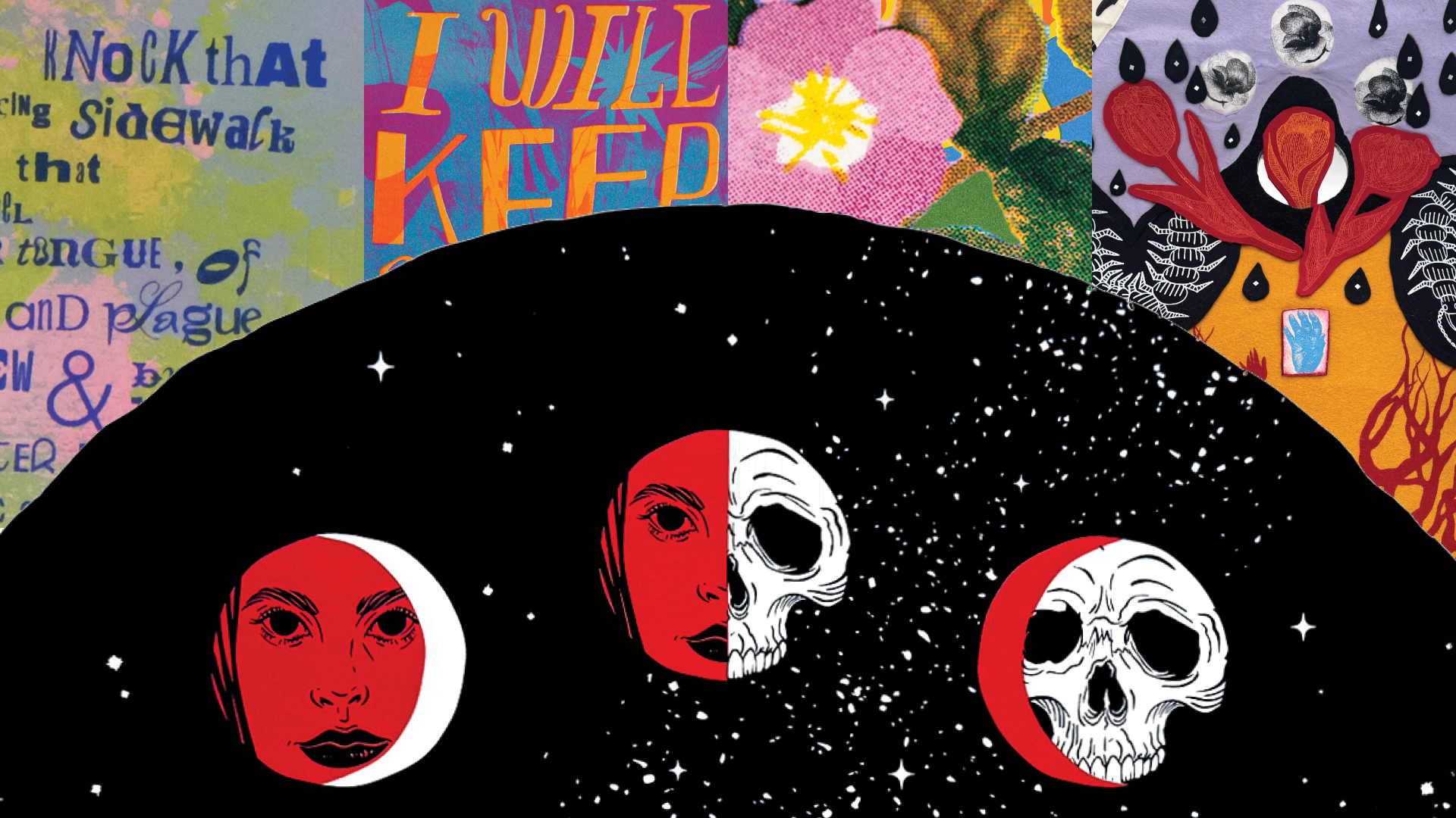
A Meditation on Ageing and Womanhood: A three-piece series on the quiet erosion of self. From the fleeting vitality of youth to the cast-aside “old hag,” fading under the weight of society’s gaze long before time’s final breath. Beauty, body, and spark—all touched by impermanence, all returning, eventually, to the stars. Partly inspired by Sharon Blackie’s Hagitude.
New Beginnings
8″ x 10”, two colour print on foil
HJALMER WENSTOB
Tlehpik Hjalmer Wenstob was raised on Tzartus island in Barkley Sound, in Huu-ay-aht First Nation’s territory, off the west coast of Vancouver Island. It was there that his understanding and desire of pursing both his traditional Nuu-chah-nulth and contemporary art practices began.
Hjalmer Wenstob is an interdisciplinary artist who specializes in sculpture and carving. He is Nuu-chah-nulth from the Tla-o-qui-aht First Nations on his father’s side, and Norwegian and English on his mother’s side.
Hjalmer speaks of three dialects of his work; contemporary, traditional, and community-based. His work is at times highly political, and uses humour and irony to pose difficult questions of respect, reconciliation and environmental issues.
Small Raven
6″ x 6.5”, one colour print
Herons
14″ x 21”, three colour print
The Comox Valley Art Gallery collaborates with community partners to support artists in their professional development and creative research through artist residency opportunities and exhibition presentation. During the Wachiay Residency series, the artists were hosted at the CVAG Next Door Artist Residence.